Cyberpunk and Vaporwave: is it the same or yet different?
Short answer: related, not identical – they speak the same visual language, but they tell different stories. Here is how to see them together and use them well.
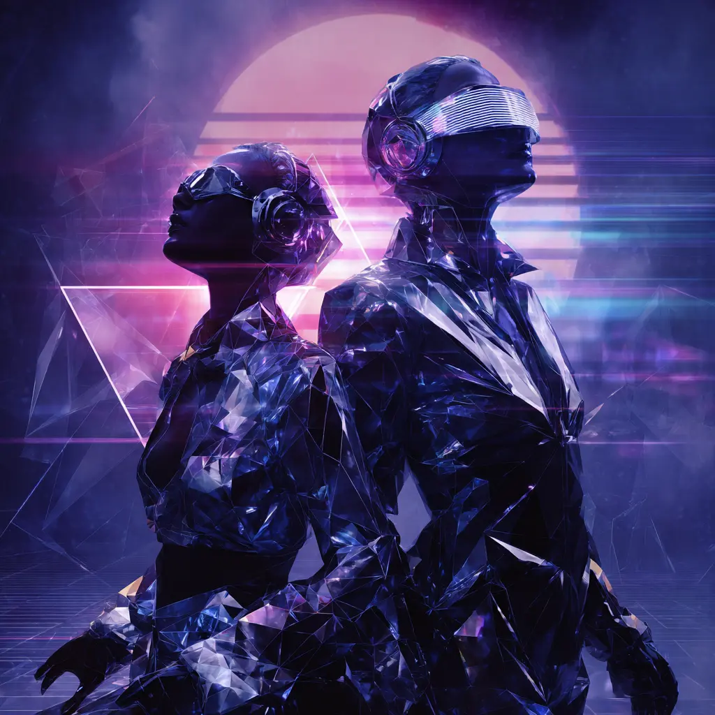
TL;DR: Same toolkit – neon, CRT, gradients – different posture. Cyberpunk adds story and tension; vaporwave holds a calm, nostalgic frame. Mix with one anchor piece, a tight palette and simple frames.
Origins – why the mood feels different
Cyberpunk grows from science fiction and cinema. It is character and world driven – rain, movement, power, crowds and systems. It looks five minutes into the future and asks what it does to people. Vaporwave rises from internet music culture and graphic design. It is mood first – UI windows, mall atriums, chrome words, VHS bloom and sample based nostalgia. It refracts the 80s or 90s idea of the future into a present day atmosphere.
Both examine the same techno capitalist world. Cyberpunk is explicit – power and inequality at street scale. Vaporwave is oblique – brand kitsch and mall ambience held at arm’s length. Different voices, related questions.
Color, light and materials
Cyberpunk is not only teal and magenta. Expect the orange of sodium streetlights, sickly greens, cold whites and glossy black – textures that swing from industrial, rain slick grit to clean glass and metal. Vaporwave is not only pastel either. Next to soft gradients you will see electric pinks, saturated violets and chrome highlights wrapped in haze. Both adore glow – they just aim it differently.
Lighting tips: set RGB strips to a single accent color, keep one neutral white for task light and avoid strobe effects. Glossy surfaces reflect hard highlights; matte paper and satin frames calm the scene.
Objects and architecture (including megastructures)
Cyberpunk frames megacities and megastructures (arcologies, skybridges, endless housing blocks) – plus alleyways, layered signage, motorbikes and augmented bodies. You feel motion and scale. Vaporwave lingers on desktops, dialog boxes, Greco Roman busts, palm trees and sunsets. It is not limited to small scale – stylized city silhouettes and softened megastructure facades often appear as graphic memory rather than street detail, flattened into pastel planes.
Typography, UI and sound
Cyberpunk treats type as infrastructure – stacked signage, dense kanji, warnings and wayfinding. Interface elements feel functional or tactical. Vaporwave treats type like an object – chrome letters, serif nostalgia and retro GUI panels used for atmosphere. Sound cues differ too: cyberpunk hears sirens, fans, transit and bass; vaporwave hears muzak (mall background music), synth pads and tape wow. Your room can borrow these cues – a poster with stacked signs versus a chrome wordmark over a gradient – to land the vibe fast.
Composition and camera feel
Cyberpunk reads like a moving frame – low angles, tight alleys, reflections, rain and parallax. Faces are lit by screens and signs. Vaporwave reads like a paused frame – centered objects, horizon grids, sunset circles and big negative space. Think of cyberpunk as a scene and vaporwave as a poster. Both can be graphic and bold at distance.
Why they work in real rooms
Both styles are graphic, legible and strong enough to anchor a wall. Cyberpunk adds narrative weight. Vaporwave adds air and color. Together they balance each other – one driver, one passenger. They also pair well with common setups – RGB lighting, glass desks, consoles and streaming gear.
Explore room ready picks in the Gaming Room Wall Art and Vaporwave collections.
How to choose – by vibe and context
If you want focus – let cyberpunk lead. Pick a piece with deep blacks, hard highlights and visible weather. It pairs well with darker walls and metal accents.
If you want ease – let vaporwave carry the palette. Pastel gradients and chrome type set the tone without overpowering the space.
If you want both – choose one anchor and one counterpoint. Keep the color family tight so the glow feels intentional.
Room recipes
Command center – one cyberpunk city slice in a black frame, neutral wall, RGB set to a cool white with a single accent color.
Soft neon corner – vaporwave gradient poster, white frame, warm ambient strip light and a low gloss desk surface.
Balanced set – vaporwave anchor plus a small cyberpunk detail print, 10-12 cm gap, top edges aligned.
Mixing without noise
Use a simple rule: one driver, one passenger. Decide the driver’s palette first, then add one or two supporting works from the other style. Give each piece room to breathe and use neutral frames so the glow does the talking. Large scale compositions of megastructures can anchor either style – high contrast and gritty for cyberpunk, smoothed and pastel for vaporwave.
Common mistakes
- Over saturating both styles at once
- Too many fonts or logotypes in one cluster
- Frames that clash with the palette
- Strobe heavy RGB that fights with the art
Buyer’s checklist
- Size – pick a print that fits the wall span. One large anchor is cleaner than many tiny pieces.
- Paper – matte or satin to reduce glare near screens. Gloss looks great under controlled light.
- Frame – black for cyberpunk, white or pale wood for vaporwave. Keep profiles slim.
- Spacing – leave 10-12 cm between frames. Align either top or center lines.
- Light – one accent color in RGB, one clean white for tasks. Avoid rainbow cycles.
Mini glossary
- CRT
- Old tube screen with visible scanlines and a soft bloom.
- Muzak
- Mall background music used for a calm, slightly surreal mood.
- Megastructure
- Very large building type such as an arcology, skybridge complex or endless block.
Six line timeline
- 1980s – cyberpunk breaks out in fiction and film.
- 1990s – GUI culture, chrome type and malls spread.
- 2010s – vaporwave rises from internet music and visuals.
- 2010s – RGB lighting and gaming setups go mainstream.
- 2020s – hybrid cityscapes blend both palettes.
- Today – rooms mix one anchor print with a tight palette.
FAQ
Can I mix them in a small room
Yes. Use one anchor piece to set the palette and one small counterpoint. Keep frames simple and leave breathing room.
Do megastructures fit vaporwave
They can. Use softened silhouettes and pastel planes so they read like graphic memory, not street detail.
What frames work best
Thin black or metal frames for cyberpunk. Slim white or pale wood for vaporwave. Avoid heavy ornate frames that fight the graphic look.


Final thought
Are they the same or different? Think siblings, not twins. Same district, different accents. Choose the lens that fits your mood – or open both windows and let the city glow in.